
Double Dissolution Senate Analysis
May 1, 2016 | 13:00 | Federal | 2016 | SenateSo, now we’ve lost Group Voting Tickets (GVTs), and people will now actually be able to preference candidates they want rather than candidates that are chosen for them … what do we expect to happen?
Ok, so we have a couple of questions we’ve got to ask ourselves:
- Who do people vote for?
- Who do they preference after their first box?
- How many boxes do they fill in?
And, to be fair to (all the effort I may have definitely already put into) my analysis
- How much does preferencing matter at all?
I hope to cover a few of these briefly in this post, but importantly, there is much left to do. I will be covering improvements on these analyses over the next few weeks, and hopefully predicting the outcome of the election before I go and vote (as an exercise in personal nihilism).
Who do people vote for?
We are lucky to have two, complete, data sources for the last Federal Election:
Great! We have an idea of what our primary votes will look like in the senate. But we’ve still got to adjust to parties changing in the polls (goodbye Clive). There’s no (or at least, not much) polling data on senate voting (all the pundits love polling for the HoR). So… well… I’ve made some best estimates of state-by-state swings for each of the big parties, and a general percentage for the other parties (about 20% in most states).
But what about other things. Like… voter error:
LDP Vote% vs. "ballot placement vs. LNP". The average gain is about ~2.5% if they appear first. #vicvotes #auspol pic.twitter.com/UVgWzzJMU1
— geekLections (@geeklections) December 2, 2014
Well I’ve gone through the process of making some best judgements of genuine voter error (which is only really the LDP / LNP issue). Which is cutting off 6-6.5% of the LDPs vote in NSW, and moving it back to the LNP.
But we still don’t know where these votes are going.
Who do they preference after their first box?
Well, let’s go back to the ATL and BTL from the last election, and use the preferences from those. Right?
Well… Kind Of.
Let me explain. The problem with using this data by itself is two-fold:
- The ATL Votes are just one single mark, and the vote follows the GVT
- the GVT was decided by the party, not the voter, so we can’t assume voter preferences will follow the GVTs.
- The BTL Votes are only valid if 90% of the preferences are filled in
- So all of the votes have a large number of preferences filled in, which is unusual for an Optional Preferential Voting system (OPV)
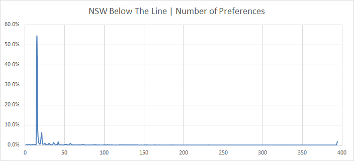
So, I’ve gone deep into NSW State Election data for the Legislative Council in 2015. Thankfully they keep every preference. And I did the following:
- Grabbed all the BTLs from NSW.
- Converted them into BTLs from electable candidates.
- Electable candidates are just the top of the minor party tickets, and a few candidates deep on the major parties.
- It’s a better way to look at how deeply voters end up voting
- And then I made a profile of how deep voters end up voting.
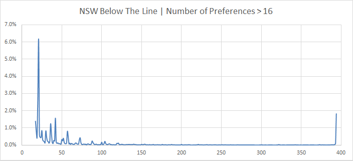
And zooming in for > 16 votes:
So, this has a few cool features:
- Voters love voting for the minimum they’re told to. 54.5% of them. Wow.
- 2.5% of Voters didn’t even reach that threshold.
- And there’s a nice kick in the curve at the end for the sticklers that vote in every box. (My kind of people)
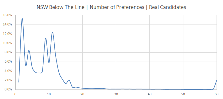
So we just have to change the length of this curve, and adjust it for real candidates:
And then cut off the actual BTL votes for each state at these levels. Cool!
But the ATLs?
Well, we can do the same analysis for how deep people vote:
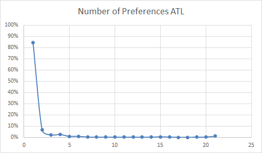
So, it’s kind of hard to see anything past the vast majority of people who only number a single box, so let’s take a look:
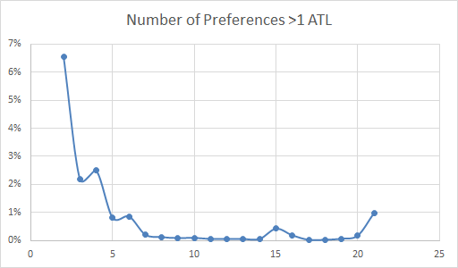
Cool things:
- People love round numbers (10 has more votes than 9)
- People saw the number 15 on the ballot paper (for the minimum requirement BTL) and then preferenced to that level ATL (the kink in the curve), and:
- About 1% of people will fill in all the boxes above the line.
But there are some important differences between the NSW ATL and the new Federal Requirements.
- People need to preference at least 6 ATL
- People will remember only filling in 1 ATL historically for the federal election, so might end up doing only that
With the savings provisions, these erroneous votes will still count, but they will affect preferencing. So I’ve made an initial model with the following features:
- I assume ~85% of people will mark 6 preferences
- Based on the 85% of people who follow the rules to the minimum requirement Above The Line
- This might be a bit confident, so I have run this initially with 42.5% voting for 1-only, and 42.5% voting 1-through-6.
- I don’t think it’s reasonable to assume many people will vote for 2,3,4 or 5 boxes above the line. But it is a possibility I’ve excluded (especially Green and ALP voters)
- 2.5% will mark fewer than 6 (using the NSW BTL error rate)
- This works out to 0.5% for each of 1,2,3,4 and 5 candidates marked.
- The rest of the ATL vote will be distrubuted out to the final candidate in a similar profile to the one given above (with a slight bump at 12, since that’s also printed on the ballot paper).
Well, show us some pretty graphs?
So finally, after a lot of work (and awful, awful code), we can make a little hex map of who would have been elected in a DD election in 2013 with the senate rules introduced in 2016.
With 42.5% of ATL voters marking 1-through-6
The states, in order are: NSW, VIC, QLD, SA, TAS, WA and the two territories down the right. Returning to the original 85% preferencing exactly 6 parties, Family First would lose their only seat to Nick Xenophon.
With 85% of ATL voters marking 1-through-6
Cool, right‽
More analysis coming sooooon!
P.S. The unknown parties? PUP is Yellow, LDP is dark blue, Orange is the Nick Xenophon Team and Light Blue is Family First. The major parties are Green for The Greens, Red for ALP and Blue for the LNP Coalition (Including WA Nationals).